In music videos she absolute adores love scenes as she’s a soppy romantic, however hates scenes of violence as she’s all for love and peace in the world. She loves BCU of artists as they show real and true emotions which she can connect to
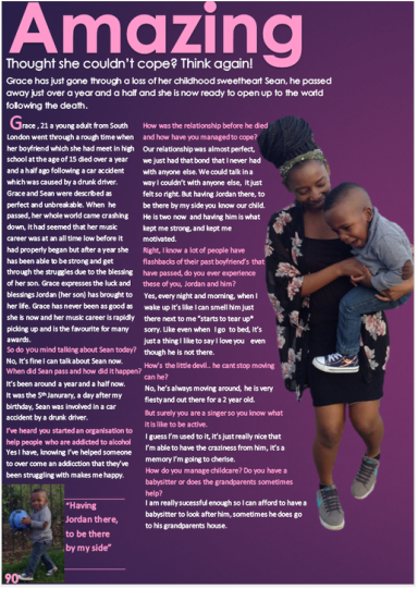
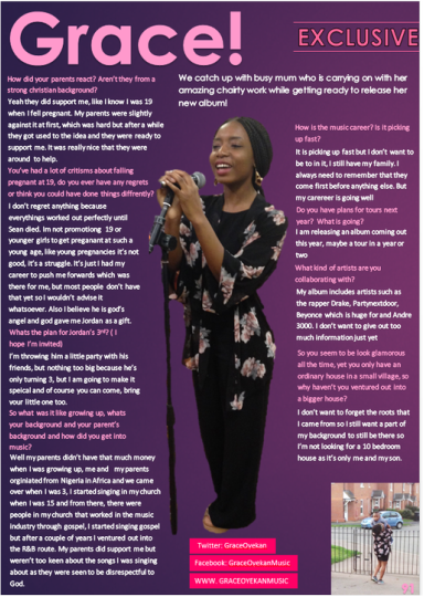
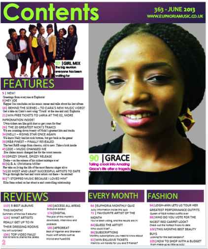
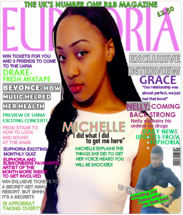
Michelle is a teenage of 19 who fashion goddess who loves her high street clothes and her trendy trainers, she loves brands such as Hollister, Super Dry, Adidas, New balance and Nike. She may be this shopaholic but she understands the value of money and has a job in order to supply her with the latest trends. She enjoys using E-media such as Twitter, YouTube, and Instagram. She enjoy keeping up with the latest news of her favourite elite persons via these social media sites. She loves to listen to R&B because of the range of artists out there and also she grown up listening to that genre with her parents, she also enjoys other genres such as hip-hop, rap and gospel, she would normally download her music via iTunes as she supports artists talents and thinks they deserve to be paid for what they produce. Her favourite artists include Beyonce, Ashanti and Ciara.
In music videos she absolute adores love scenes as she’s a soppy romantic, however hates scenes of violence as she’s all for love and peace in the world. She loves BCU of artists as they show real and true emotions which she can connect to
0 Comments
Minor changes have been made to my contents page but everything remains similar, the other changes I've made was spacing some of the cover lines, and also included a page number.
I found some more improvements I could make to my front cover, I think the previous cover had too many headlines around the main image making it difficult to read, so what I decided to do was to condense the amount of cover lines I included and spaced them out. The picture above shows the template for the updated front cover. Other changes that have been made:
1. Moved the "IS AFROBEAT TAKING OVER??" from the left side to the right side of the magazine. 2. Included the issue number, the date the issue was published and the website page. 3. Moved the Michelle cover line below so people can still focus on the main image. 4. Changed the wording of the Nelly cover story from "NELLY: COMING BACK STRONG" TO "NELLY: COMING ON STRONG" 5. Headlines been spaced out. It has now been some time since I have posted on my blog as I thought I was about finished with my magazine product, now I am at the stage of writing up my conclusion for all my magazine pages and looking to go in depth and explain the reasoning to some of the choice I have made. I am still looking for improvements to make on my pages in order to produce a good magazine.
This is my first final draft of my magazine front cover, I have tried to include as many cover stories as I could so that it is informative and also to try to make it seem like an actual magazine cover. In a recent post I had mentioned that my class was asked to assess everyone's music magazines and try to list 3 improvements to make, so the past few days I have taken on the advice given by peers and tried to make my magazine better.
The images I've presented above are not clear but I should still be able to talk about the changes I've made. Like mentioned throughout the feedback given many people mentioned that the light pink writing made it difficult to read, so what I did was change the light pink writing to a darker shade of pink so it is easier to read. In my evaluation I will use close up screen grabs of my contents page so it's easy to read.
Furthermore, another change that has been made is I've moved the Grace banner above which was placed on the bottom of the main image, the reason for this is because I got a comment saying 'having the banner at the bottom makes the photo look cropped' and as a person that takes on criticism I wanted to change it so because thought my magazine was good. The top image is the previous image and the bottom picture is the present two page spread. A few changes that I've made to my two page spread are that I've changed the font size and font style of the first paragraph that starts with 'thought she couldn't cope' as it wasn't easily visible with the previous font. I was deciding where to put my main title, whether it looked better in the middle or towards the left and I came to the conclusion of putting it on the left side of the page because I don't think it suits being in the middle, and lastly I've decided to fill the right corner with a picture of my elite person and her son, simply because it looked empty.
As a class, me and my class mates were set a target to get our music magazines finished and finalised. I felt I had come to stage where I was nearly finished, and was just finalising everything. Then our teacher had asked us to go round and view everyone else's front cover, contents page and two page spread, then we were asked to write atleast 3 improvements we could make in the three area's. Here's some of the feedback I got from my class mates:
Front page ·Pictures looks pixelated · Include Barcode · More potential for font variation ·Room for more cover lines ·Make cover lines a big bigger so they stand out more than others ·‘Michelle’ could be bigger Contents page ·The pale pink writing makes it hard to read as its too small and light, so you could try a darker shade of pink ·White banner on white background makes picture looked cropped ·Try to include a date, issues number and a barcode Double page spread ·The 'Party ( I hope I'm invited)' needs closing brackets ·Try to fill up bottom right corner with something, as it looks empty ·There’s a few spaces you could fill ·Spelling of ‘Exclusive’ ·‘though she couldn't cope…’ could be bigger-
|
AuthorWrite something about yourself. No need to be fancy, just an overview. CategoriesArchives
May 2015
|